Re: [RFC PATCH 0/3] docs: pdfdocs: Improve alignment of CJK ascii-art
From: Mauro Carvalho Chehab <mchehab@kernel.org>
Date: 2021-06-25 10:24:38
Also in:
lkml
Possibly related (same subject, not in this thread)
- 2021-06-24 · Re: [RFC PATCH 0/3] docs: pdfdocs: Improve alignment of CJK ascii-art · Mauro Carvalho Chehab <mchehab@kernel.org>
Em Fri, 25 Jun 2021 18:22:26 +0900
Akira Yokosawa [off-list ref] escreveu:
On Fri, 25 Jun 2021 09:50:59 +0200, Mauro Carvalho Chehab wrote:quoted
Em Fri, 25 Jun 2021 14:55:24 +0800
"Wu X.C." [off-list ref] escreveu:
quoted
On Thu, Jun 24, 2021 at 09:06:59PM +0900, Akira Yokosawa wrote:quoted
Subject: [RFC PATCH 0/3] docs: pdfdocs: Improve alignment of CJK ascii-art

Hi all,
Hi Akira,quoted
This is another attempt to improve translations' pdf output.
I see there is a mismatch in the font choice for CJK documents, which
causes poor-looking ascii-art where CJK characters and Latin letters
are mixed used.

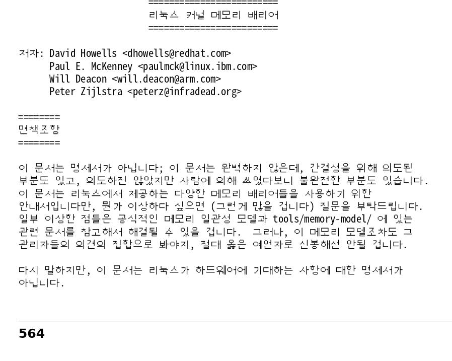
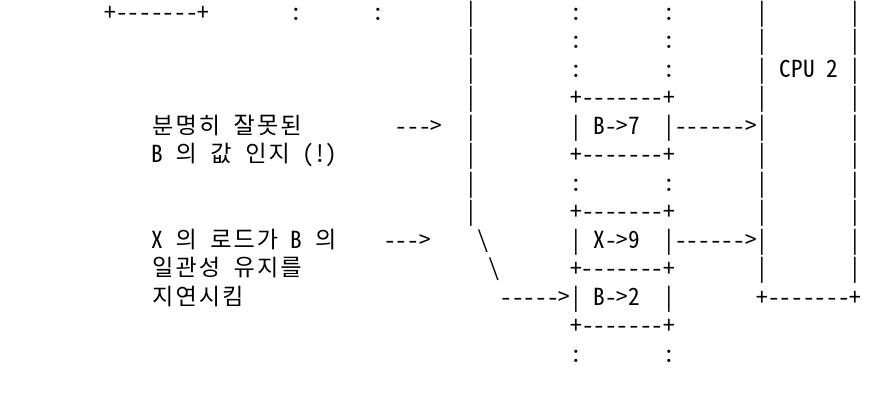
One of noticeable examples of such ascii-art can be found in
Korean translation of memory-barriers.txt.

Hence the author of Korean translation of memory-barriers.txt is
in the CC list.

At first, I thought the issue could be fixed by simply selecting
"Noto Sans Mono CJK SC" as both of monofont and CJKmonofont.
It fixed the mis-alignment in the Chinese translation, but failed
in the Korean translation.

It turns out that Hangul characters in "Noto Sans Mono CJK SC"
are slightly narrower than Chinese and Japanese counterparts.
I have no idea why the so-called "mono" font has non-uniform
character widths.

GNU Unifont is an alternative monospace font which covers
almost all Unicode codepoints.
However, due to its bitmap-font nature, the resulting document
might not be acceptable to Korean readers, I guess.
OK, it works. But I still want to say that the display effect of Unifont is really not good. Unifont's lattice is too small, and only one size. http://fars.ee/QA1k.jpg http://fars.ee/GAAv.jpg Looks like computers 20 years ago, LOL :) It there any chance to use other fonts, like *Sarasa Mono* ? 等距更紗黑體 Looks more beautifull http://fars.ee/DTT6.jpg But I guess not many people installed it.Thank you for the nice suggestion. Yes, Hangul characters in "Sarasa Mono" have the same widths.quoted
Does Sarasa mono looks nice for Japanese, Chinese and Korean
(plus latin)?
Yes, I tested "Sarasa Mono SC" and it covers all CJK fonts. The SC variant has Simple Chinese glyph where other languages have their own preferred glyph, but that is same in "Noto Sans Mono SC". Currently, there is no verbatim/literal blocks in the Japanese translation, so I tested with only a short Japanese sentence. I'll post a v2 which uses "Sarasa Mono SC" instead of Unifont.quoted
If so, I guess it shouldn't be a problem to use it, as the
./scripts/sphinx-pre-install can be patched to recommend
its install.
One minor problem might be that the Sarasa font needs manual download (and install). Thanks, Akira

If this is not yet packaged as part of texlive packages
on distros, this won't be a minor issue, as we'll need
to find procedures and test it for all distros supported
by the script.

Thanks,
Mauro